
CLIENT:
Restore America’s Estuaries,
Washington DC, Seattle WA | estuaries.org
ROLE:
UX Strategy, Content, Web Design, Web Development, Technical SEO
OBJECTIVE:
Research, design, and develop a new website that sets RAE apart in the environmental nonprofit space.
Create a compelling UX that engages partners, prospective donors, and colleagues while providing intuitive pathways for users.
Provide keyword research and ultimately improve on-page and technical SEO to increase rankings in nationwide searches.
SOLUTION:
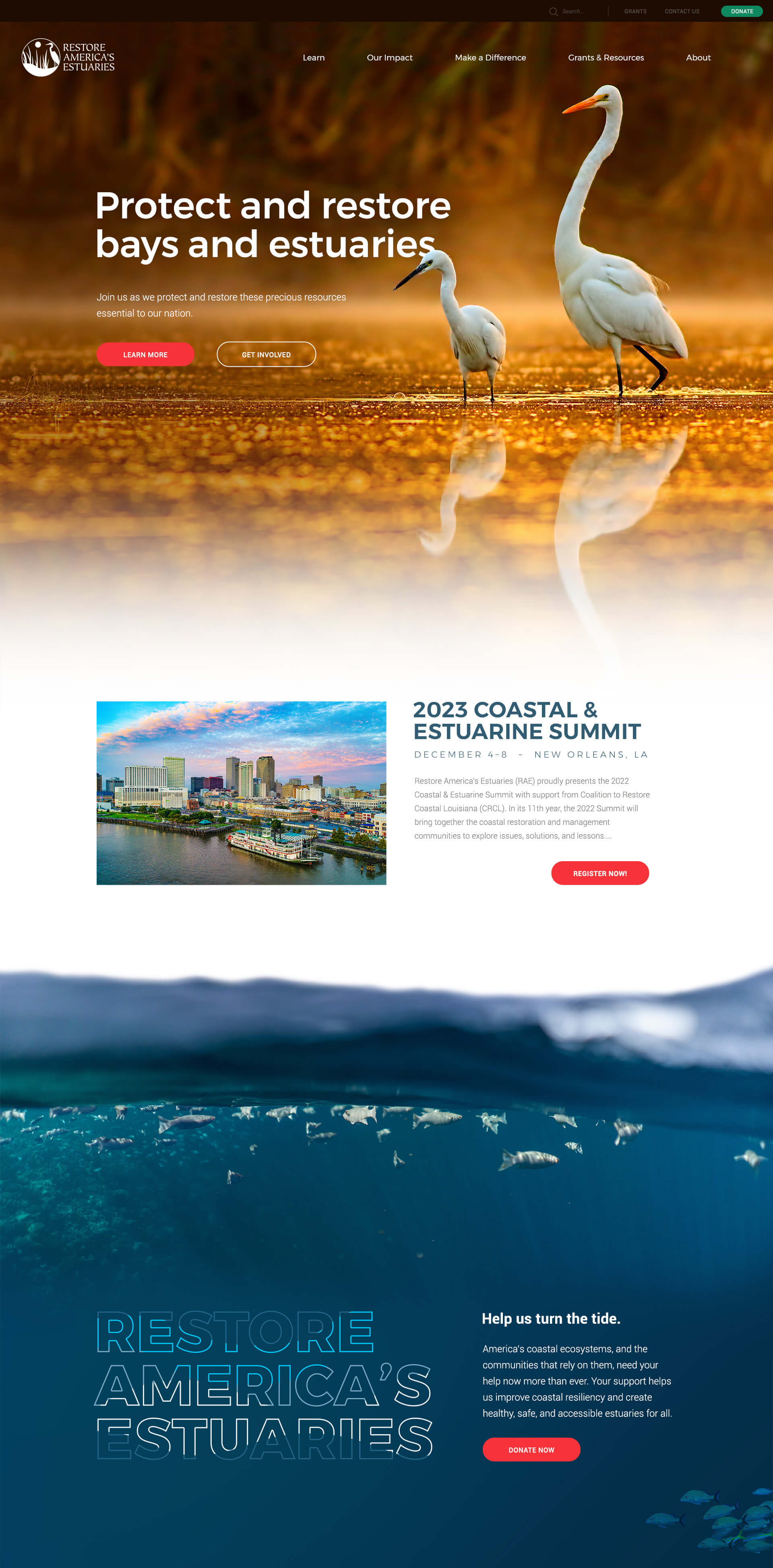
Created new topic silos and content strategy that leverages direct calls-to-action for users around RAE’s highest priorities, such as Impact and Grants & Resources. We built an intuitive navigation that includes dynamic feeds of events and other posts.
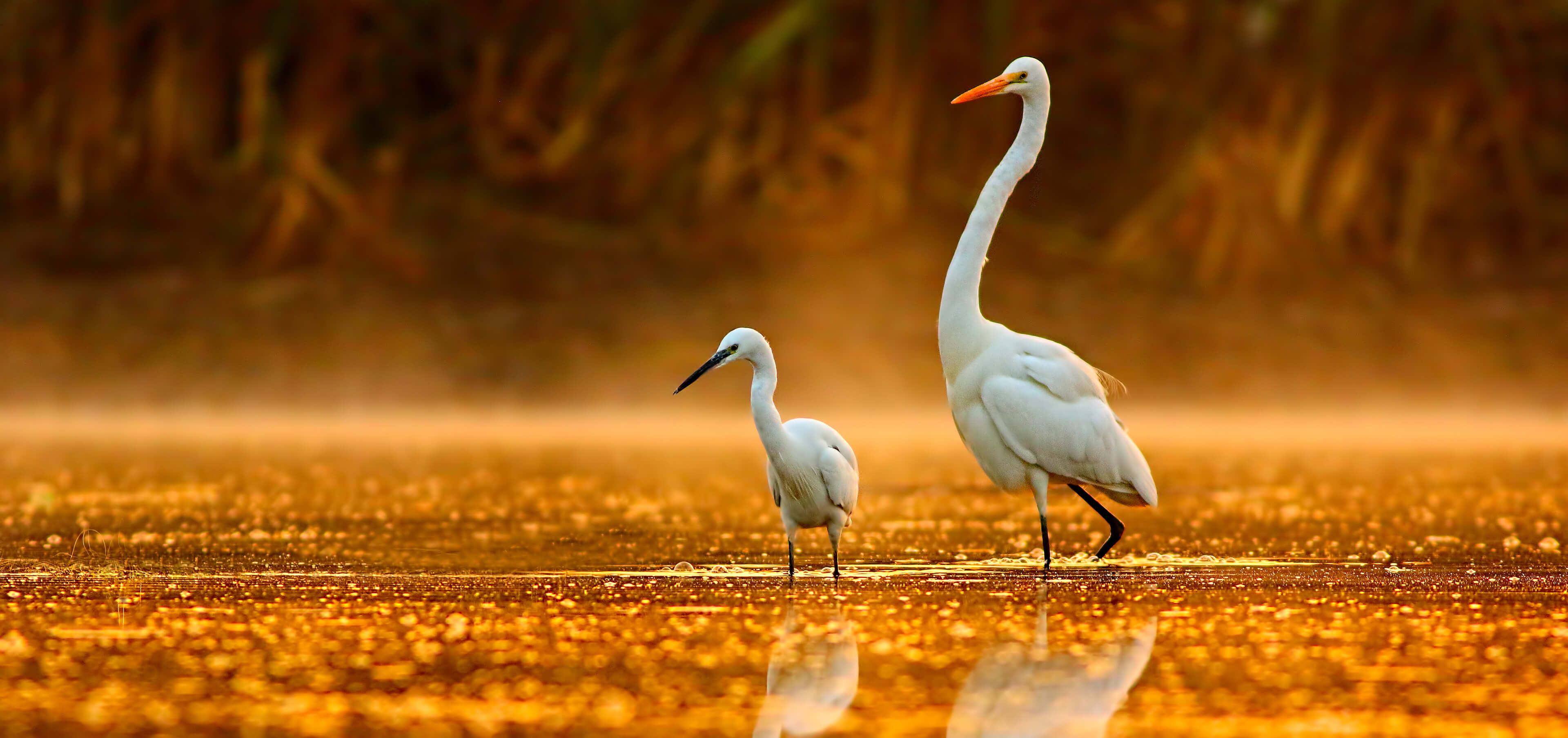
Sourced impactful images that focus on users’ most likely concerns, such as environmental restoration and species protection. We visually pushed the limits of RAE’s branding and color palette and recommended a cool base with a more lively color for actions and buttons.

After identifying the most likely user intentions based on analytics and our discovery process, we worked with the directors at RAE to build a strategic Site Map that focused on one-click architecture once the navigation was displayed.
We built an expandable navigation that not only serves a menu of options but directs users to cornerstone content that includes featured events, resources, and blog posts.
Navigation Menu UI: Multi-column navigation with search and nav descriptors helps users make their first click count.
Blogs and resources were an essential part of what RAE’s new website needed for users. Their existing base of supporters, along with future users, needed quick, easy access to stories, events, updates, and more.
We created a blog system that included multiple taxonomies — categories and tags. Next, we designed and developed category toggles in a sidebar to quickly curate the results to users’ needs. This, in addition to the options to search, sort, and access tags, made for an intuitive, centralized platform.
Chariot completed a ground-up rebuild of our website, and we couldn't be happier with the finished product. They were professional, timely, and solutions-oriented. Chariot had a way of making us feel like we were their only client.
Rob Shane, Communications Manager @ Restore America's Estuaries


