In web design, every choice made by designers contributes to the overall user experience (UX). No choice should be unjustifiable. One fascinating concept that intersects linguistics and design is the bouba-kiki effect. This intriguing phenomenon explores the connection between visual shapes and the sounds associated with linguistic expressions.
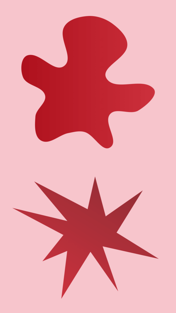
The bouba-kiki effect is a term coined by psychologist Wolfgang Köhler in the early 20th century. The effect describes a consistent tendency among people to associate certain shapes with particular sounds. Köhler presented participants with two abstract shapes—one jagged and angular, the other smooth and rounded—along with the made-up words “bouba” and “kiki.” An overwhelming majority of participants linked the rounded shape with the softer-sounding “bouba” and the angular shape with the sharper-sounding “kiki.”
Say the words out loud and listen to how sharp or soft the letters sound. Which sounds more risky to you? Probably “kiki”, the sharp, angular shape. Shapes we tend to avoid so we don’t bang our shins or cut ourselves. Is this part of why so many think of “dog” as (wo)man’s best friend and “cat” as an unpredictable or sassy little predator? What does this mean for brand rivalries like “Pepsi” and “Coke”?
In linguistics, we can see that the bouba-kiki effect plays out consistently across languages and cultures throughout the world!
This effect has profound implications for design, especially in the context of web design, where visual elements play a central role in communicating information and guiding user interaction. Applying linguistic principles to web design allows for a more intentional and effective creation of visual elements. After all, design and linguistics are both largely studies of psychology and communication. It’s all down to science.
A classic debate in web design is that of rounded corners versus sharp corners on website buttons. Do website users associate certain shapes with specific actions based on linguistic principles?
Buttons with rounded corners convey a sense of safety and approachability. Users might subconsciously associate these softer shapes with more user-friendly and inviting interactions. Rounded corners can create a visually pleasing and inviting environment on a website, potentially encouraging users to engage with the content, and to navigate near and around these softer shapes.
On the other hand, buttons with 90-degree corners exude a sense of risk and sharpness. The angular shapes may trigger associations with decisiveness, but also with danger, which can be intimidating.
Buttons aren’t the only way great designers know to integrate shapes into web design. Neither are text boxes or icons. Composing with intentional use of negative space is just as important to the journey of a user through a web page as any other element. Soft paths and open visual entryways paired with what we know about eye paths, attention span, and comprehension all fit together to complete the puzzle.
We use all the tools in our toolbox to create a sense of trustworthiness and visual interest with the goal of decreasing bounce rates, building brand reputation, and keeping users directed to the right content.
There are so many ways that understanding the bouba-kiki effect influences our design choices that we are hard-pressed to find a site we’ve designed without many examples of it.