CLIENT:
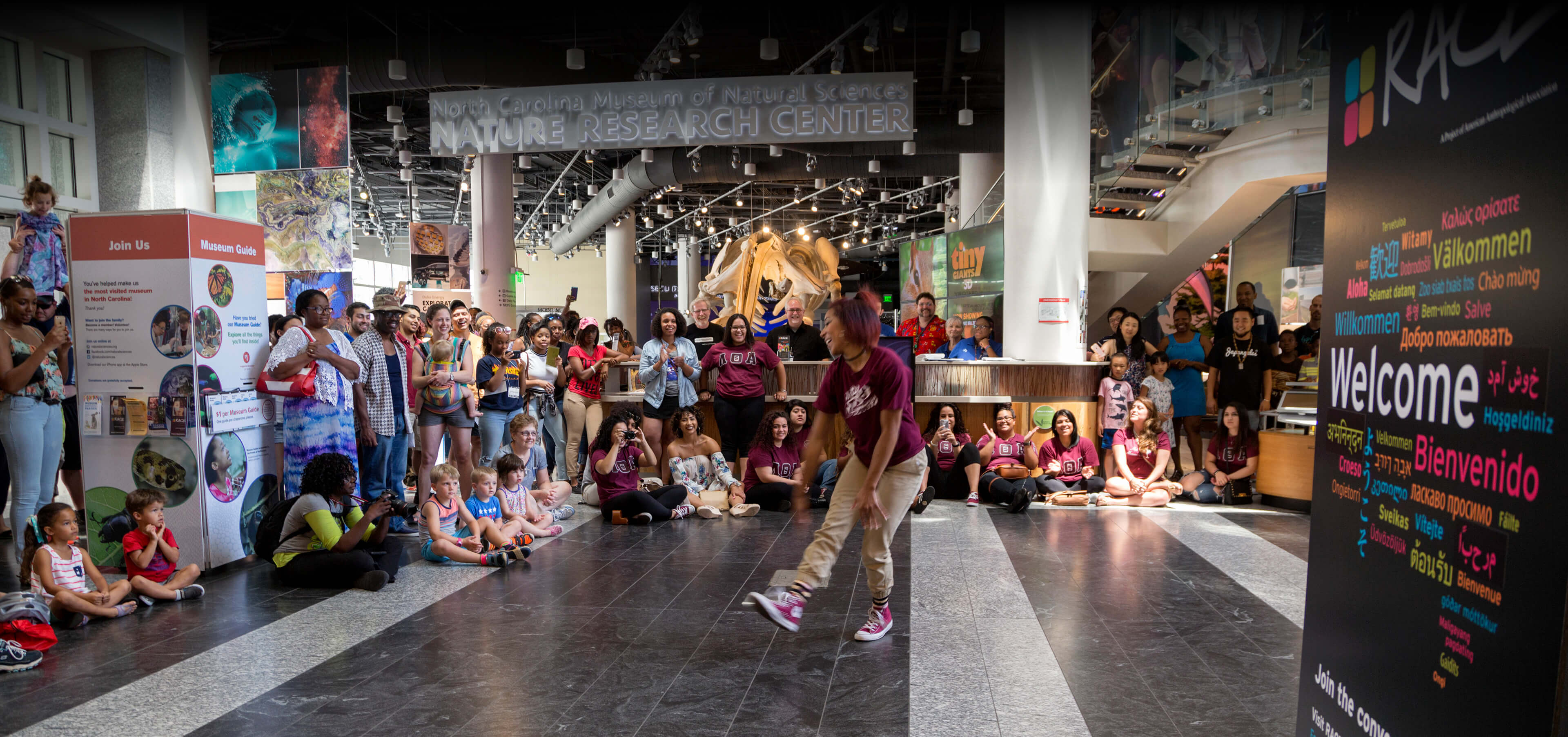
North Carolina Museum of Natural Sciences,
RACE: Are We So Different | talkaboutrace.org
ROLE:
UX Strategy, Web Design, Web Development, homepage Copywriting
OBJECTIVE:
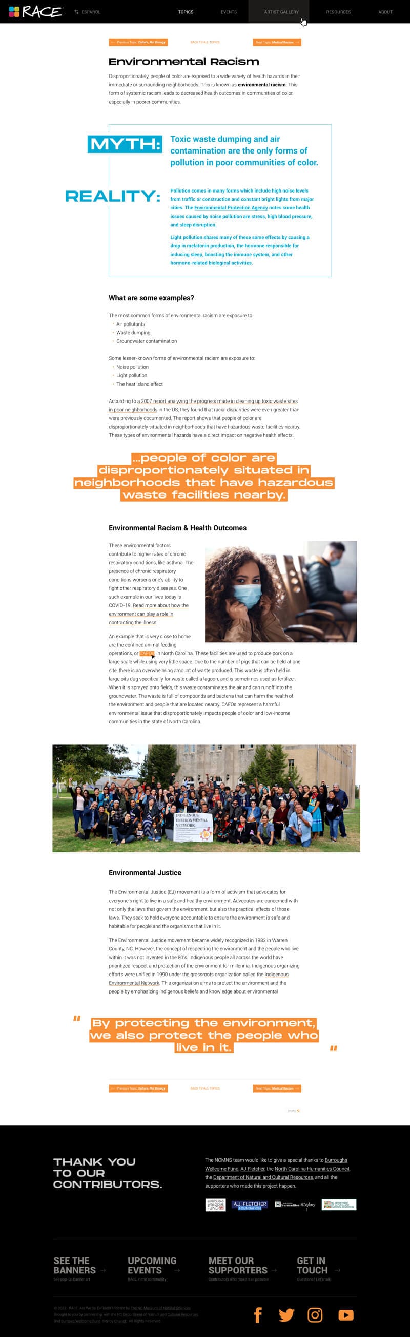
Craft a unique, engaging online presence for the RACE project that helps to educate readers, drive the message of putting a scientific lens on nationwide conversations about race, and feature banners in locations throughout NC.
The experience should carry through the profoundly important work of world-renowned cultural anthropologist and author Dr. Yolanda T. Moses.
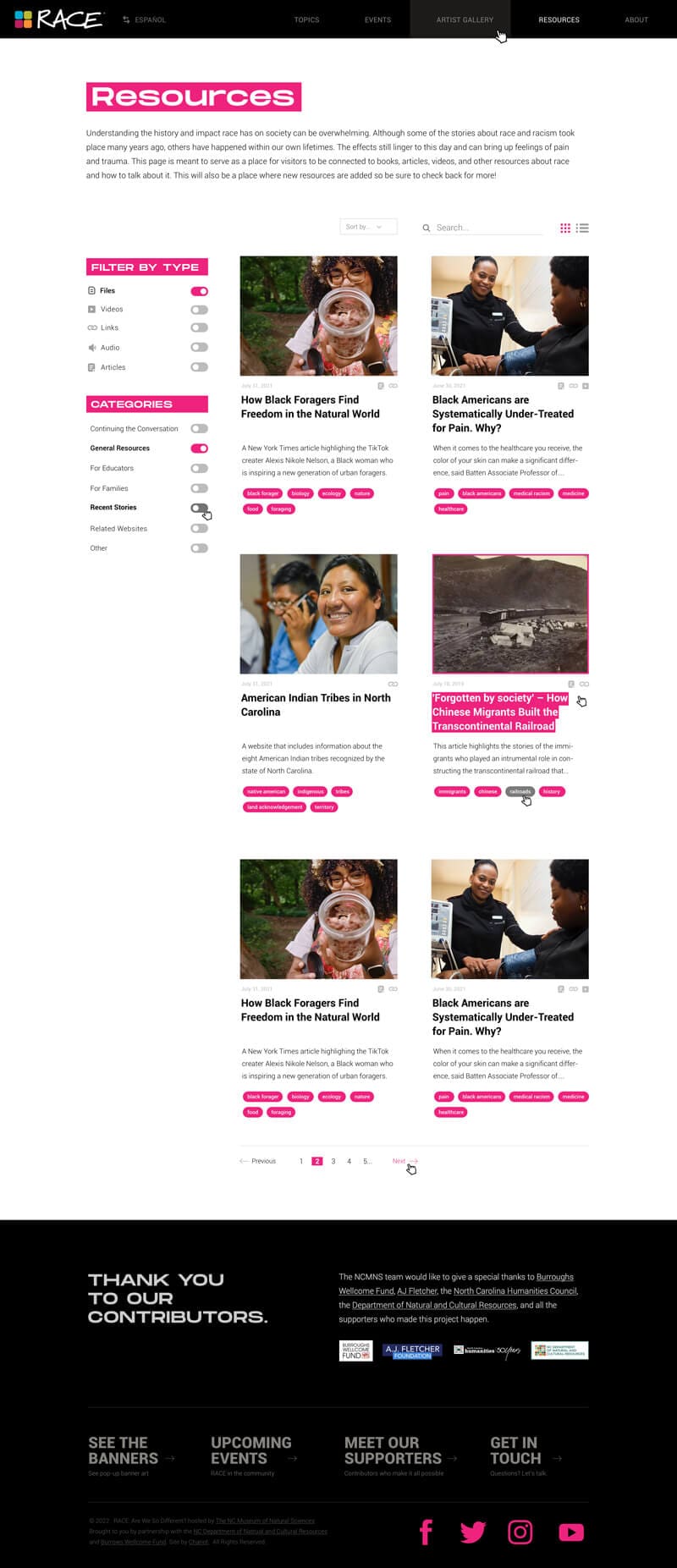
Build an intuitive Resources system that will showcase and organize articles, links, and media for public access. Engage readers and compel them to share content important to them.
SOLUTION:
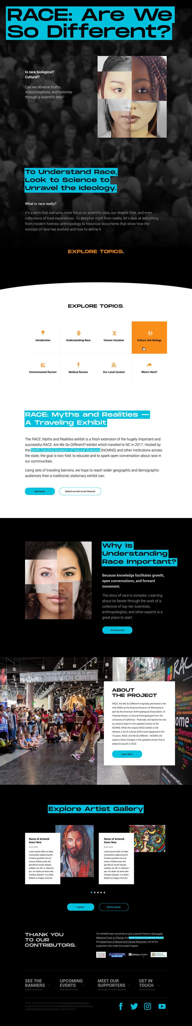
We designed and developed a large, visually provocative homepage that uses animations and bold colors to emphasize important headlines.
Our design team leveraged the brand guide to color-coordinate the main content silos: Topics, Banners, Artists, and Resources.
By using scroll effects, small interactive animations, and disruptive color blocks, we compel the user to go deeper, learn more, and get involved.
Despite the Resources System having multiple levels of taxonomies and complexity, we made sure that the user interface (UI) remained simple and intuitive.
An easy-to-use, customized WordPress CMS provides the RACE team with the power to edit any part of any page as they expand the project, add Resources, and update their message.
We created a unique and engaging online presence for the RACE project to educate and drive the message of using a scientific lens in conversations about race. We also featured their banners, placed in strategic locations throughout NC, to extend their reach and promote social justice awareness. Their website has become an essential tool in promoting meaningful change.
Our design team crafted a visually-compelling homepage for the website, which effectively captures the attention of users with its bold colors and engaging animations. To create a cohesive visual experience, we leveraged the client’s brand guide and color-coordinated the main content silos, including Topics, Banners, Artists, and Resources. This approach not only enhances the overall aesthetic of the site but also helps visitors to easily navigate and find the content they are looking for.
Resources System UI: Despite the Resources System having multiple levels of taxonomies and complexity, we made sure that the user interface (UI) remained simple and intuitive.
Our teams collaborated to find creative ways to utilize all colors of their existing brand guide in a way that was bold, impactful, and ADA-compliant regarding color contrast guidelines set by WCAG 2.1.
With specific primary colors being used for cornerstone content, we mapped a visual color guide to certain silos of topics to help visually anchor readers throughout the website.