
CLIENT:
Teach for America,
Systems Impact Lab | systemsimpactlab.com
ROLE:
UX Strategy, Web Design, Web Development
OBJECTIVE:
Redesign and develop a fresh, impactful website as a resource for educational leaders around the unified mission of improving education.
Build an intuitive Resources System that can be used by education leaders, legislators, and those who wish to lead change in the education system. The system should allow quick access across all types and categories of assets.
Provide a platform for regional education sectors to manage their own page and display their case studies in and around the use of The Six Questions Framework.
SOLUTION:
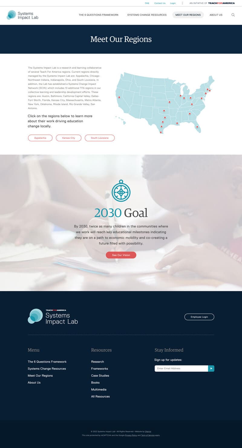
Our team worked with Teach For America and their existing brand guide to create an engaging, informative experience. We used imagery to connect the user to the overarching purpose — improving young lives through education. By building key design and interactive elements that pull users’ eyes to relevant content, we created a seamless flow.
The Resources System was leveraged as the backbone of the website. We used multi-level taxonomies to help a user quickly toggle their view and browse only what applies to them. Further, we built the site’s WordPress CMS to enable direct links to pre-filtered Resource page views. This means easier data storage & management for the TFA team.
Smart navigational UI helps users find what they need within 1 click, while sidebar navigation and a clean footer with alternate labels help to ease the user journey, no matter the intention.
Our design team put their best foot forward to create an immersive experience that abided by TFA’s brand guide. We aimed to create a visually appealing and informative experience, with the primary goal of connecting the user to TFA’s overall objective of enhancing young lives through education. We utilized compelling imagery that would elicit emotional responses from the user. Furthermore, we employed TFA’s existing color palette for essential calls-to-action, ensuring optimal eye flow.
In addition, we built several design and interactive elements to create a smooth user experience, with the goal of leading users to relevant content without any disruptions or distractions. Overall, our team’s efforts resulted in a seamless flow, where users could engage with TFA’s message and resources while seamlessly navigating the website.
Smart Navigation UI + FAQs: Using a multi-column dropdown navigation menu, with configurable columns, we were able to empower the user to find nearly anything on the website with just 1 click. On the FAQs page, we built expandable blocks that are fully configurable by the client.
Pulling from the concentric circles of the Systems Impact Lab logo, we chose compelling imagery, cropped them as circles, and strategically placed into pages to pull the user’s attention to the next section or to an important call-to-action. Negative space is just as important as design elements in UX Design, so we utilized white space tactics as well as shapes to leverage the psychological tendencies of users throughout the website.
We took a somewhat story-telling approach to present The Six Questions Framework to users in a sequential way. Better visual digestion was the goal, along with engagement, deeper clicks, accessing Resources, etc. Keeping the site fun and colorful while maintaining an intuitive UI helped to make this project an unwavering success.


