CLIENT:
Science & Environment Council
of Southwest Florida | greenlivingtoolkit.org
ROLE:
Branding, UX Strategy, Content, Web Design, Web Development, SEO, PPC
OBJECTIVE:
Create a brand that resonates with the target audience and conveys the mission of the toolkit.
Plan, Wireframe, Design, & Develop an engaging online experience that provides users with tools and resources for environmental action.
SOLUTION:
Merge simple and recognizable icons to finalize a clean, iconic logo.
Establish a color palette with a plan to visually “index” the main silos of the content. On deeper topic pages, use smart UI for a way to present heavy content using auto-tracking sticky sub-navigation. Use negative space, imagery, and calls to action to compel users.
Include Technical and On-page SEO with an internal linking strategy that optimizes both human experiences and Google’s page crawlers.
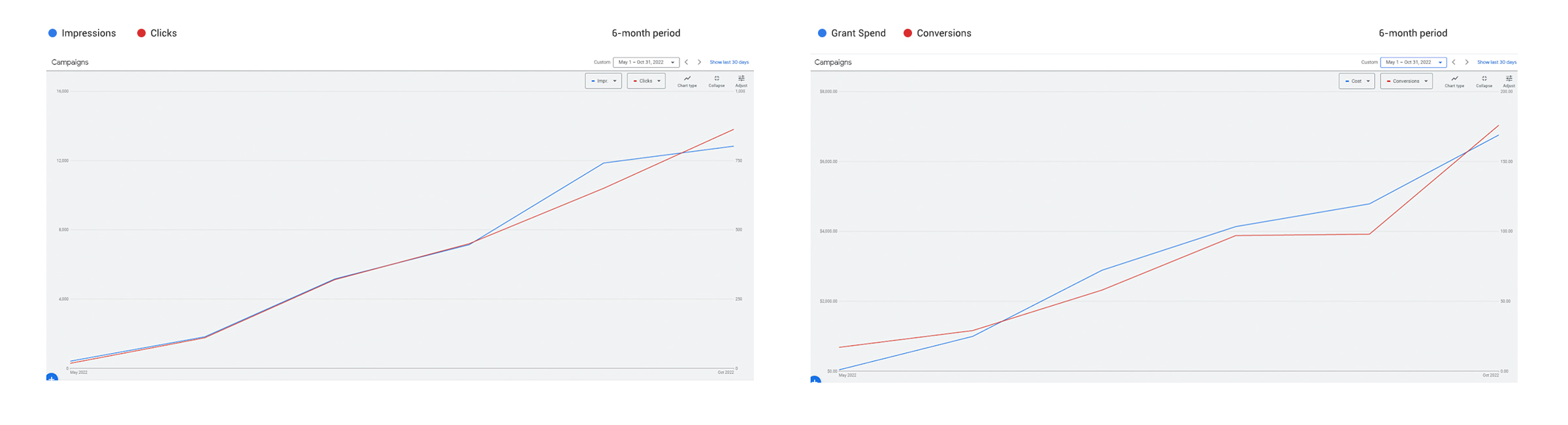
Create and manage a successful Google Grant Ads account that drives traffic to the site while maximizing usage of the monthly grant budget.
We worked with simple icons that users would easily recognize and relate to. By relying on negative space as much as color, we pushed for a clean logo that combined hard and soft shapes. This echoed the mission of the brand: A toolkit for environmental action.
The final logo design incorporated a versatile structure — able to be used in many layouts such as horizontal, vertical, and round-badge formats. The color palette we created intentionally to be a visual index of the main topics (silos) for the website content.
Content Indexation: We included a color-based visual indexation plan for the main content silos, along with a system of icons.
We collaborated with the team at SEC regarding content strategy and built a Sitemap to be the foundation of the Content Silos. We focused on a one-click architecture with reactive content elements based on mobile vs desktop users.
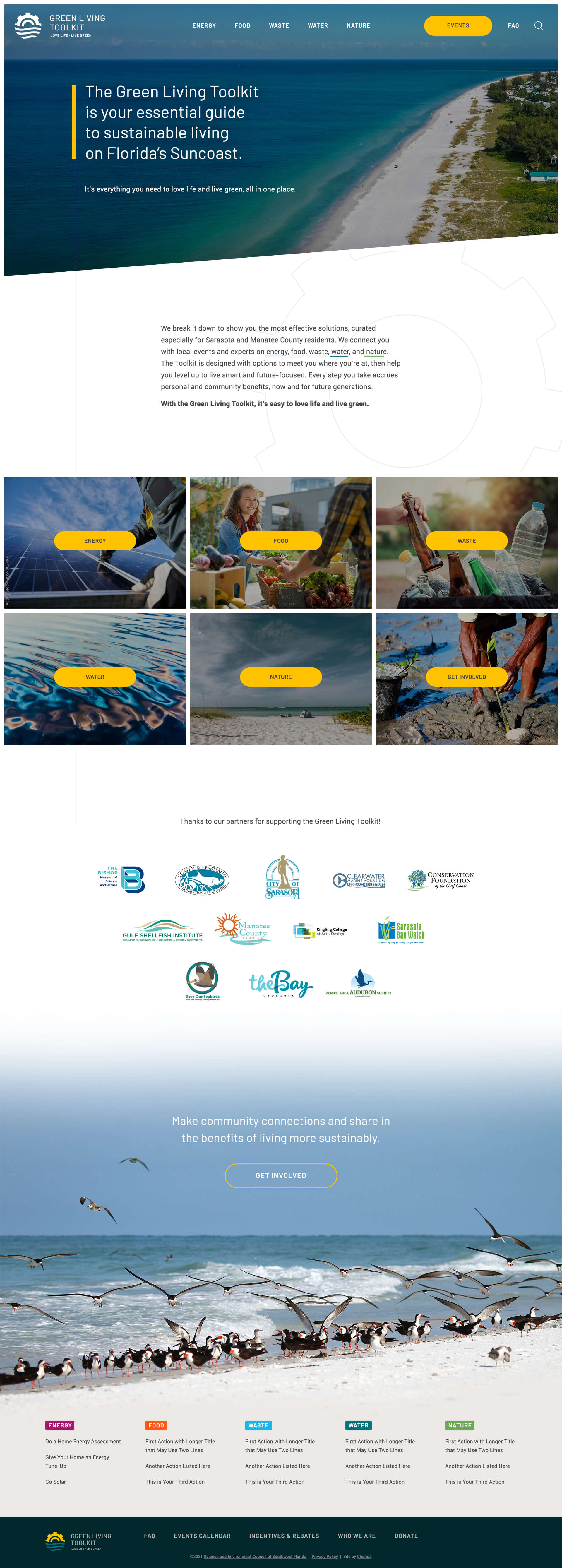
Next, we mixed a modern UX strategy with our plan for the brand elements to construct the Wireframes. As the structure of the pages started to take shape, we were able to fine-tune the plan for Web Design.
The next phase of the project included our team building full-color web page mock-ups. Per our standard, the Web Design phase is a culmination of all previous phases from Research & Discovery and Content Strategy to Site-mapping.
We carried through our goal for a clean, seamless UI. The form was the function in many cases, and our design team relied on the brand and wireframes to create a visually digestible and compelling experience.
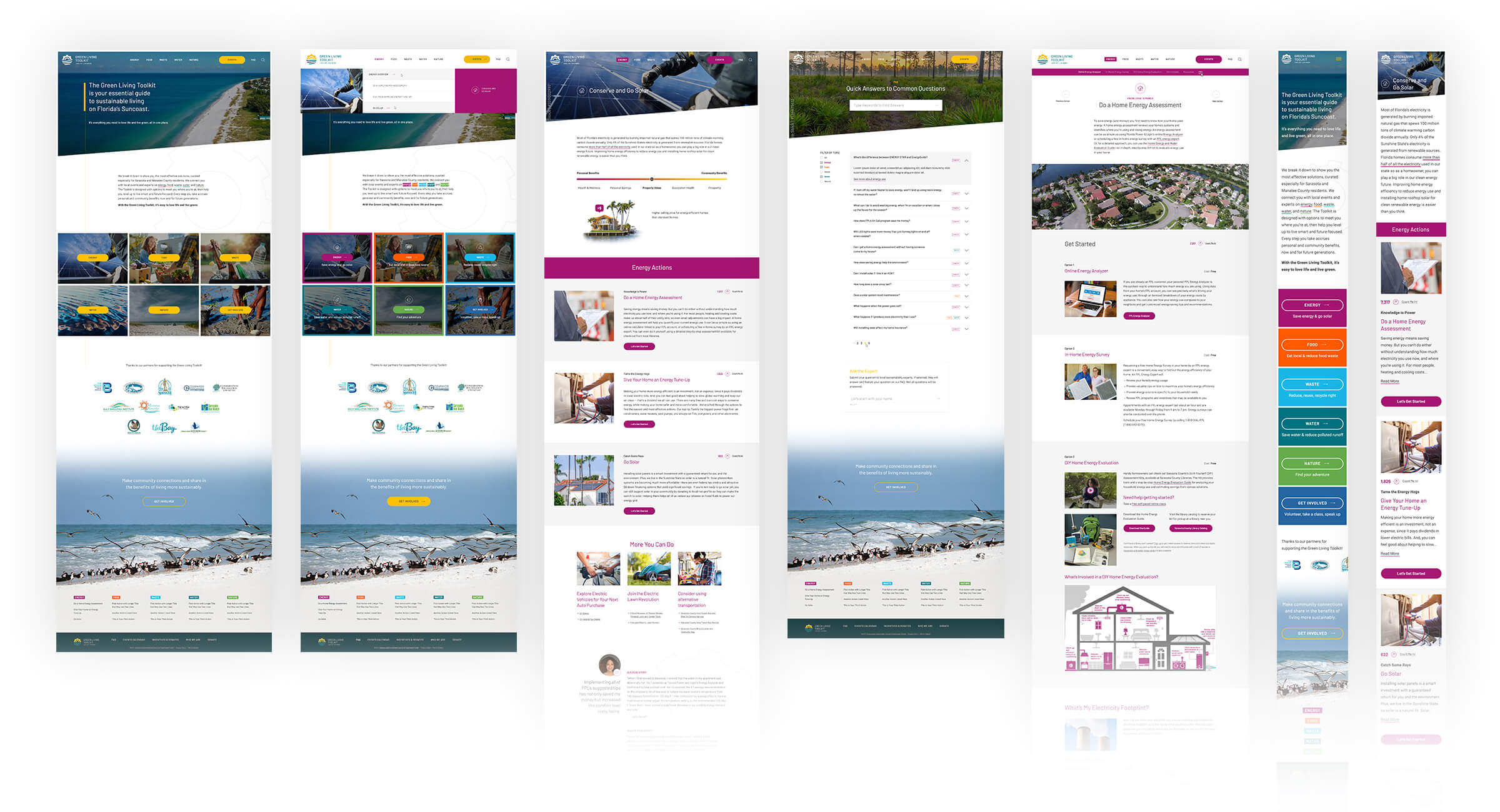
Visual Rhythms: For heavy page content, we implement brand elements along with a “rhythm” as the user scrolls to avoid user exhaustion.
Seamless, pixel-perfect development was imperative for this project. We used clean, secure code to build a website that would engage users on any screen or device. We developed a clean mega menu dropdown, dynamic sub-navigation, smooth hovers, and responsiveness that went beyond just screen-width-based CSS.
The Admin Dashboard was also customized for staff and volunteer users. The build included an Events Calendar with Custom Categories and External API Feed, a Custom Energy Saving Calculator, an FAQ System with Predictive Search, and Email CRM Integration.
Increase in Impressions, Months 3-6
Increase in Clicks, Months 3-6
Increase in Grant Budget Spend