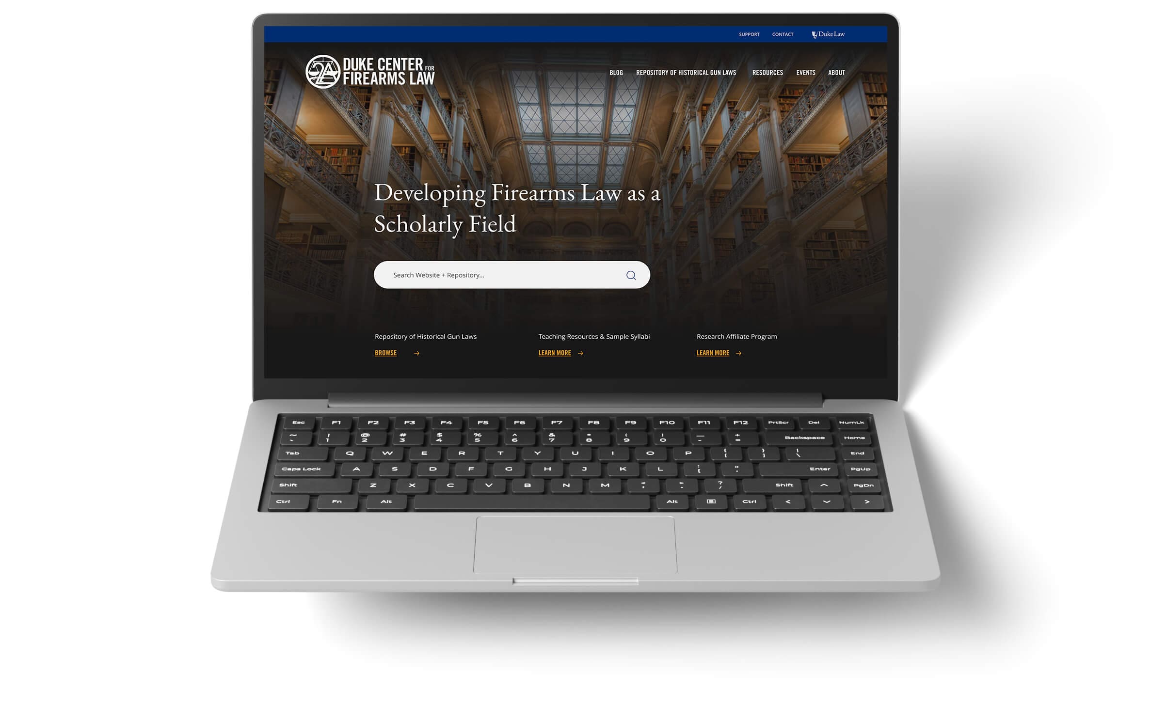

CLIENT:
Duke University Law,
Center for Firearms Law | firearmslaw.duke.edu
ROLE:
UX Strategy, Web + Software Design, Web Development, Custom Web App Development
OBJECTIVE:
Build a centralized solution for the Center that allows public users to easily search for, find, and access firearms laws based on various taxonomies.
The system should allow Duke administrators to manage website content, law data, categorization, citations, and blog resources as well as automate newsletter announcements for improved marketing workflow.
Additionally, improve web accessibility to meet ADA standards.
SOLUTION:
We designed and developed a custom-built Website, Law Repository, & CMS system that included powerful features for both users and Duke staff. The main features include:
• Dynamic Feeds for Blog, Event + Video Content
• Advanced Search with Visual UI Elements
• Wildcard, Boolean + Exception Search Functions
• Intuitive UX to Balance Complex Search Features
• Simplified, Modern Design to Improve User Flow
• Automated Email Marketing for Blog Distribution

Discovery revealed that the majority of users relied on site-wide and law-specific searches. So, we mapped and designed the site to be empathetic to this trend from the first few seconds of the experience. First impressions are everything.
Our UX strategy for the repository software and website made complex search functionality both inviting and easy to use. Clean design, with a search field within the homepage’s hero section and repeatedly throughout the site, ensures no user is frustrated. Design composition uses data from eye-tracking studies as well as the fascinating linguistics + design studies on the bouba-kiki effect that informed our treatment of buttons and calls-to-action.
Within the bounds of Duke Law’s visual brand guidelines, we created an elegant and highly effective aesthetic that never placed form above function—both succeed equally.
Users can filter articles by groups, categories, contributors, and more.
Custom controls enable a 1-click mass email send-out for new blogs.
Global search automatically delineates results across 3 content types.
Users can email articles to a colleague from within the website.
Mobile-responsive strategy resulted in near 50/50 split in traffic by device
Since the audience of researchers would not only be looking for historical data, the Blog system would be an important tool for all users to stay up to date on laws, legislation, litigation, scholarly articles, and other news.
We implemented quick-find features based on Types, Categories, and Authors that allow users to quickly toggle or filter only to topics they’re looking for. Further, the detail pages include activated tags, links to posts by authors, and an option to Share the post with friends or colleagues via email.
Intuitive Access to Global Search: Users can initiate their search with a wide scope and swiftly narrow down to a customized result in just 1-2 clicks, regardless of the content type they seek.
We collaborated with Duke University Law to rethink the standard search options found in most library management systems and repository software. Researchers and law professionals have come to expect certain functions and UI, so we created intuitive solutions that leverage those conventions and provide multiple options to refine the thousands of possible results down to exactly what the user is looking for.
Multiple, layer-able parameter sets that include Boolean operators, Exclusion searches + Wildcard searches
Dynamic date slider allowing users to set a date range parameter and adjust on the fly
Visual Map selector to filter each law search by one, or multiple, states
Advanced Search UI: The new system allows Wildcard, Boolean operators, and Exclusion-type searches while allowing the user to edit other taxonomies including a data range slider easily.
Along with rethinking standard repo search options needed in an institutional repository system such as this, visuals were paramount to offering a clean interface, with very complex capabilities such as filtered and advanced search features. With a strong sense of exactly what users of the site would need and the conventions they were used to, we worked to refine and improve the experience.
We relied on our client’s expertise in their field and combined our expertise in web design + web and software development. The end result is a powerful search platform that offers complex functionality without visual exhaustion. The new Repository Search Tool includes higher-level search parameters such as Search by State, Year Range (slider or entered years), and Entered Keywords. The expandable Advanced Search panel offers more exact options such as Wildcard searches, Boolean operators (and, or, not), and Exclusion-type searches.

We built a custom integration of Duke’s email marketing platform (MailChimp) via a two-way API connection. This enables Duke staff to automatically send a Blog announcement to all of their subscribers without having to leave the Blog Admin Dashboard. All automation works while the subscriber list remains dynamic. This integration includes a returning data check showing “sent” vs. “unsent” for specific blog emails, avoiding double send-outs.
A custom News Feed system leverages an external RSS feed. To display as many data points for each story as possible, without leaving gaps in the user experience, we coded the feed to find and import the article thumbnail for that article via the feed. If no thumbnail is included, the site will automatically place an image from a specific collection in the website’s main library. Destination links could include external URLs or downloadable files such as PDFs.
Marketing automation for the win.

Our team worked with Duke University IT’s Web Accessibility team to ensure that the website and advanced search tool were compliant with ADA guidelines (WCAG). This included a visual audit of the Design and the addition of special HTML tags throughout the navigation menu, search fields, and taxonomy settings to ensure that users with screen readers can easily access and use every part.