CLIENT:
Community Based Care
Multi-state health care provider
ROLE:
Brand, strategy, content, web design, Web Development, SEO
OBJECTIVE:
Strategically re-brand newly acquired home care business with some likeness to existing CBcare.com branding. Connect with existing + New audiences while improving UX + SEO.
SOLUTION:
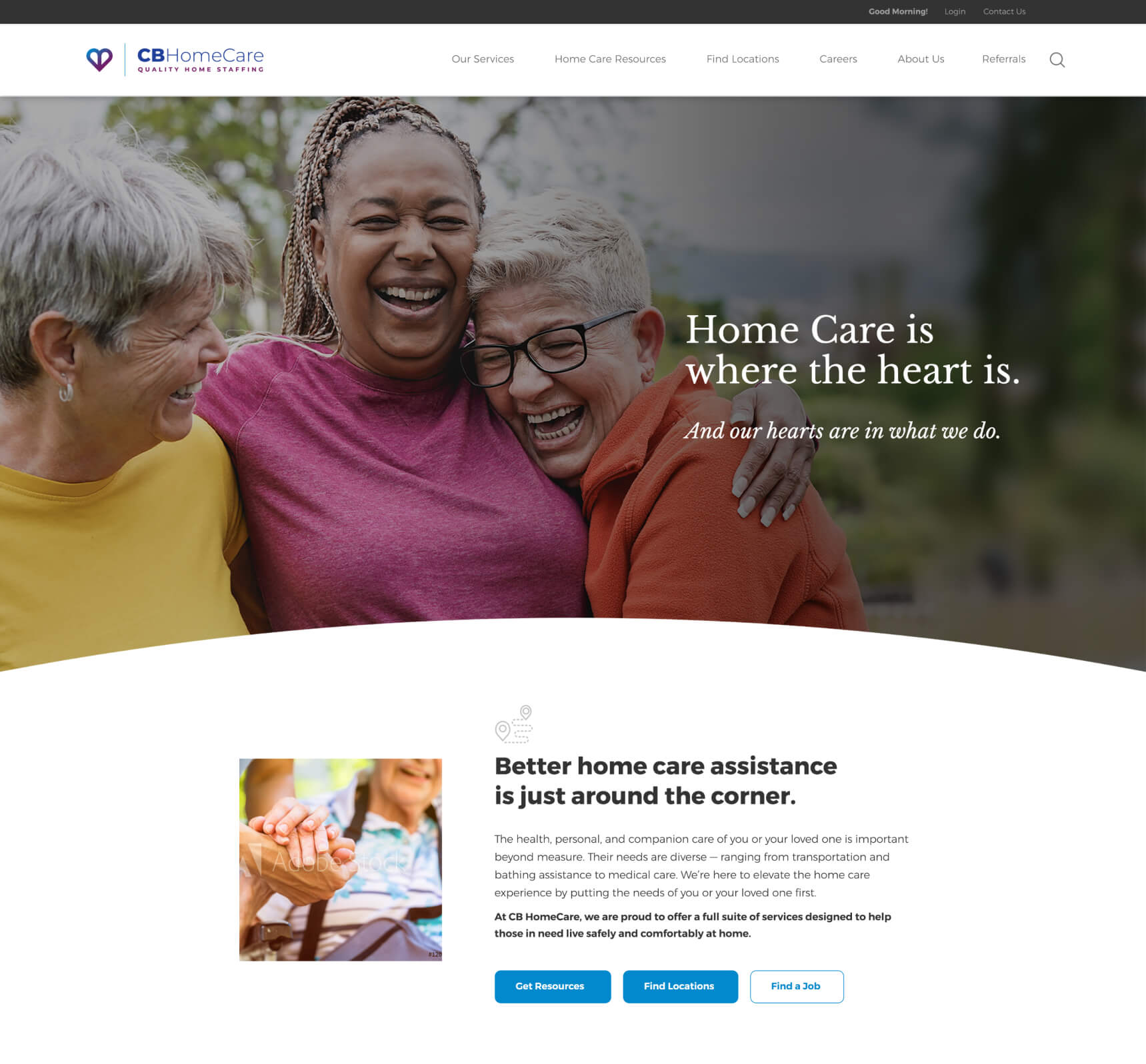
soft, human colors help drive the emotive appeal of the Brand while a shape similar to CB Care’s logo maintain connective tissue with the flagship brand.
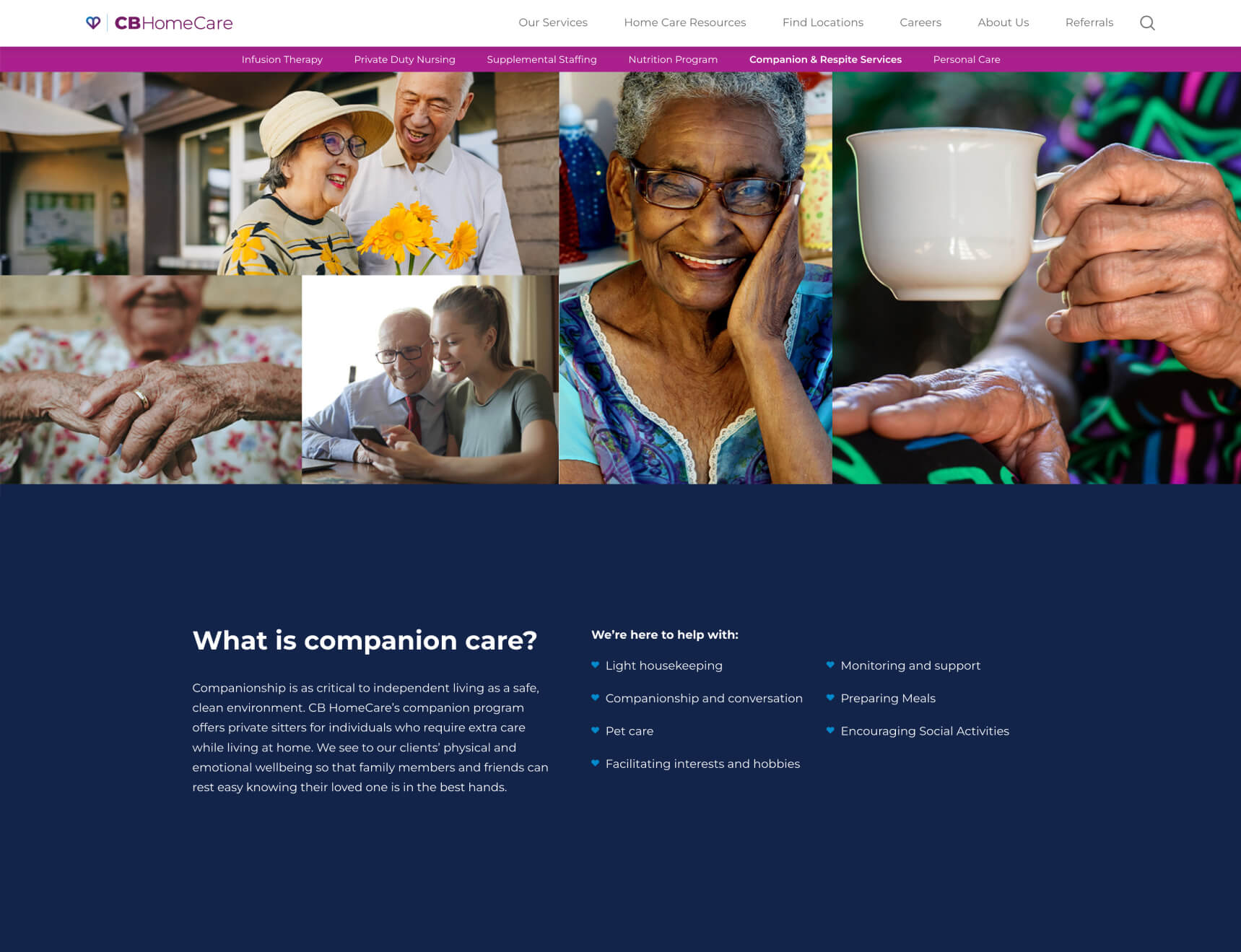
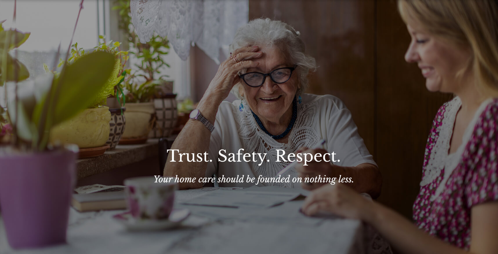
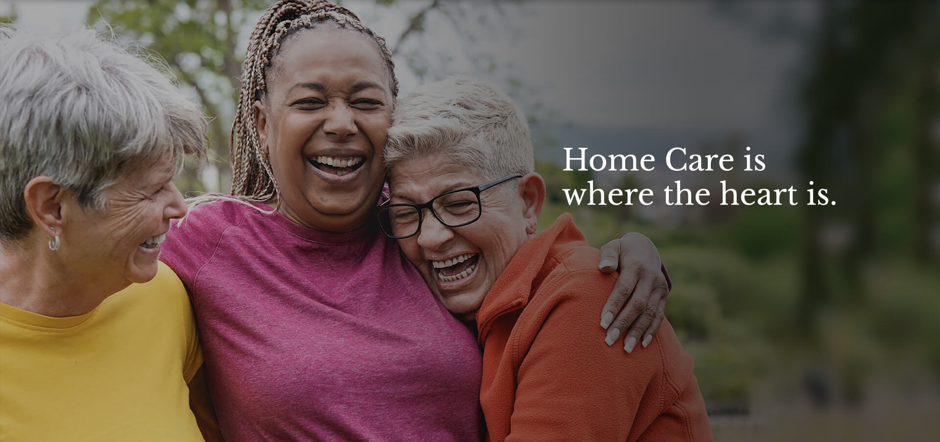
warm, moment-based images help bring “heart” into the web UX. larger on-screen elements along with negative space avoid visual fatigue making for a more intuitive experience for users. Strategic UI pulls users to helpful tools and calls to action.
RESEARCH + DISCOVERY
COPYWRITING
BRANDING + LOGO DESIGN
SITE MAP + PLANNING
WEB UX DESIGN
CUSTOM WEB DEVELOPMENT
ON-PAGE SEO
GOOGLE ADS MANAGEMENT
After helping them to establish a new brand for Community Based Care (CBC), they remained with Chariot to create a secondary brand for their Home Care sector. We worked with CBC to carefully navigate their newly acquired brands and locations within the home care industry while including consistency with their current standing brand.
The challenge was multi-faceted. With a very different target audience, we would need to craft a way to resonate back to parts of their main CBC logo, while presenting a secondary brand that was fresh, clean, and warm while still being consistent.
We worked through concepts that leveraged popular icons around home, comfort, and well-being. The considered approaches included shape, style, and most of all color. Their iconic blue palette in the original CBC branding was strong. In order to depart from those colors with the Home Care logo, we needed to do it strategically.
After a few rounds and a few whiteboarding sessions, we had a solid direction! We could purposely introduce a new, vibrant color while relying on a similar shape to the map marker icon realized in the main logo. We quickly go to work on a new brand guide and ways to use this vibrant color for calls-to-action and content silos on the new website.
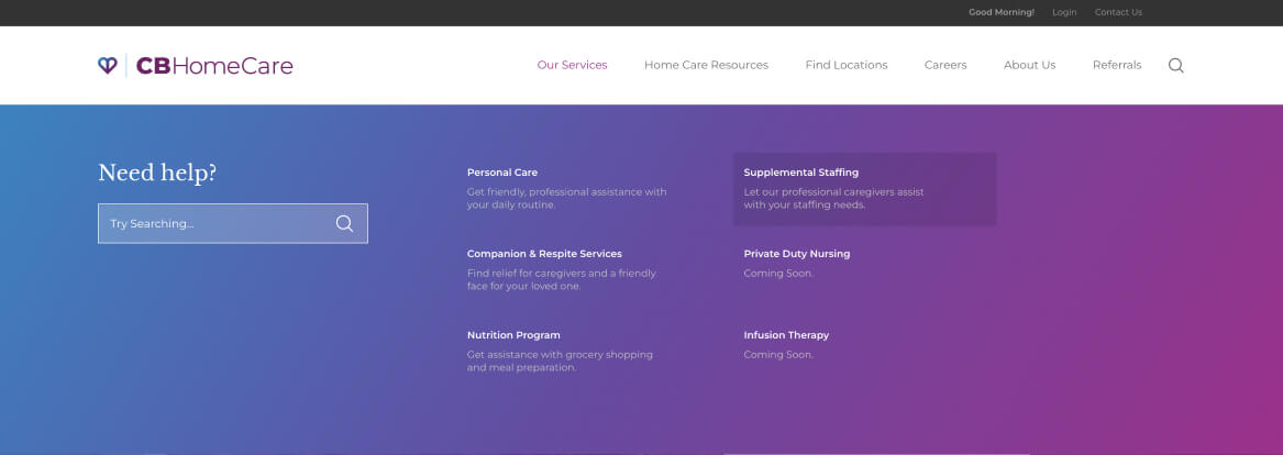
Strategic UI: Multi-column navigation with search and nav descriptors helps users make their first click count.
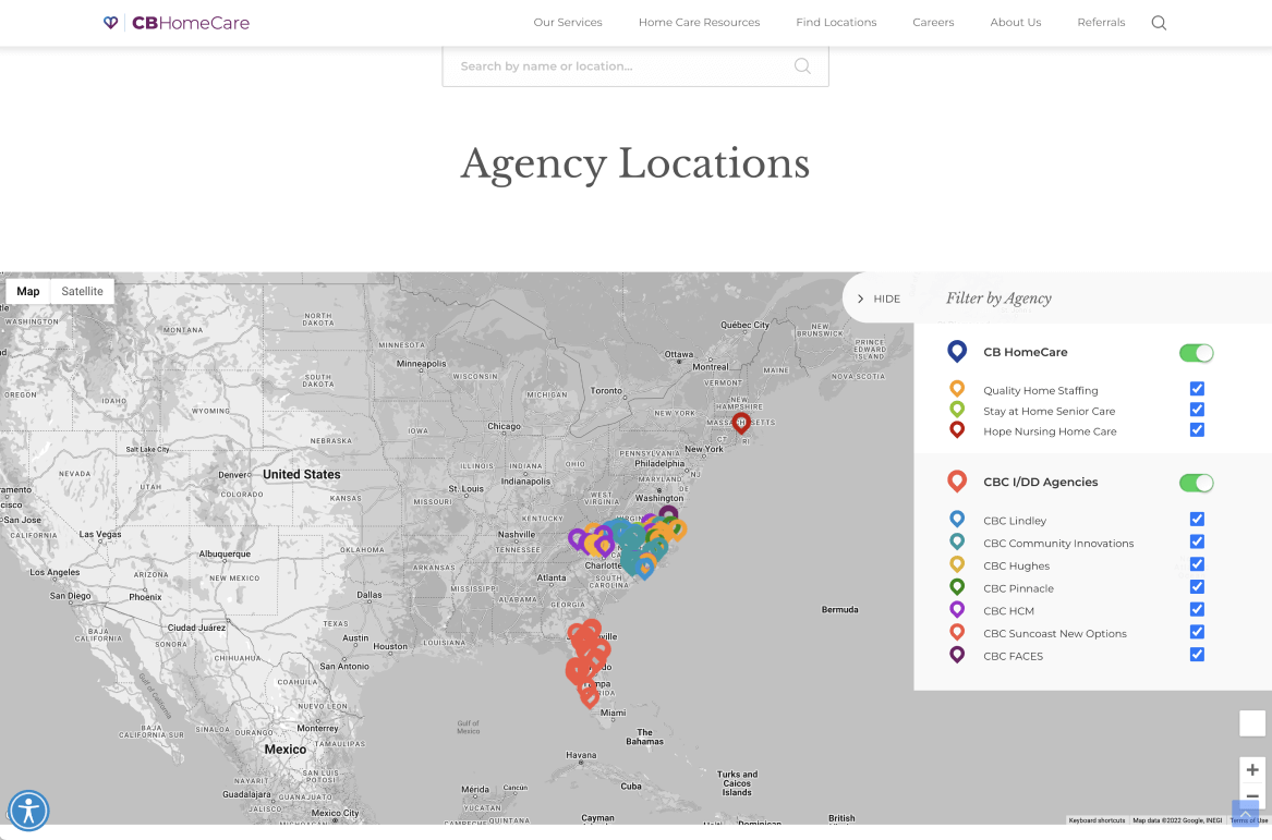
Custom Location System: Custom agency location system with quick filters, live toggles, and search help users and administrators find locations and gain easy insight, from macro to micro.