After meeting with the owner of Third Day Market and touring the construction site of their soon-to-be main market location, we were excited to help this new business achieve the next level. Their down-to-earth approach, along with their pre-existing popularity as one of the best garden centers around, made it obvious to us that their refreshing, helpful culture should be represented in their new branding.
We quickly got to work on Research & Discovery, and laying the foundation of a branding and marketing strategy that would carry the project through. Little did we know how much their presence and capability would grow in the next two years.
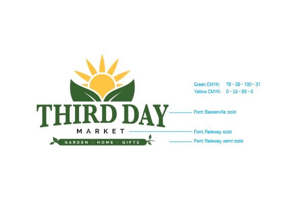
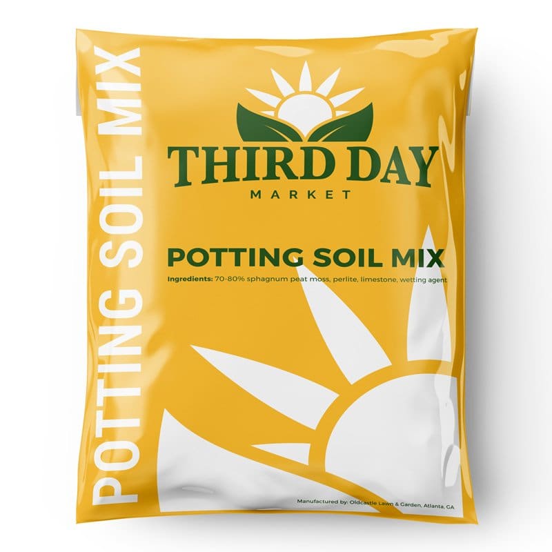
With some familiarity among the local community, Third Day didn’t want to navigate too far from their original logo concept. So we worked with them on logo design to create a clean, bright logo that would help establish a strong brand and lend itself well for use in digital and physical mediums.

Any well-built strategy starts with research, purpose, and knowledge. Per our tried & true digital marketing process, we started with discovery into keyword search volumes and audience behavior trends. Analyzing a wide variety of metrics on the interwebs gave us a better idea of who Third Day’s target audience should be, what they actually search for most often, and how that applies to what the Market will actually offer.
Armed with information, this enabled our team to identify a list of priority keywords & topics that will return the most inbound traffic versus the efforts put into SEO and content.
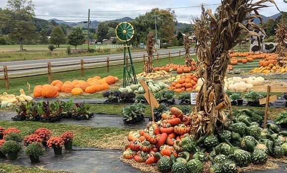
In addition, we established a strategy of going after geographical SERPS and swapping out optimized content and UX elements based on the season. For example: For Spring, the content strategy is to be geared towards flowers, produce, weddings, outdoor events, etc. For the Fall, emphasis would be placed on their famous pumpkin patch, fall events, pre-Christmas sales, root veggies, and more. Then, of course, we monitor, measure, and adjust each season and each year. Onward and upward!
Based on the data gathered during research, we then carefully crafted the best plan of attack for the user experience (UX) into what we marketing nerds like to call the Customer Journey. Using the keyword research and a prioritized list of predicted audience interests, we put together a strategy that split website traffic right from the get-go: the homepage. This would take visitors directly where they needed to go using either a concise call-to-action or a point of engagement consisting of imagery or value. In summary, we created an anticipated behavioral road map consisting of main highways and possible side roads.
Getting into the nuts & bolts, we then built a site map that would act as the bare-bones plan for the website pages and navigation. This map helped to guide our team in the next steps and keep the client knowing what to expect.
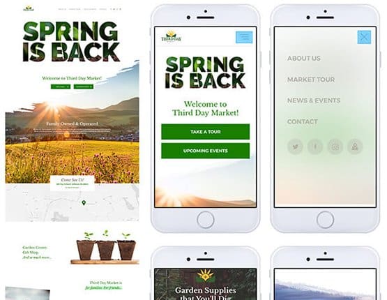
Next, using the data and planning established by the research, customer journey, and site map, we put together the website wireframes. This is where the data begins to merge with very rough design elements to establish a visual framework for the homepage and other key, high-converting pages of the new website. Brand introduction and driving visitors to the physical location were one of the top priorities in conversion efforts, along with story-telling and capturing what visitor info they could.
As with any website, this wireframe acted as the very beginning stages of the design. However, it more heavily addressed the planned touch points of the custom journey and conversion efforts.
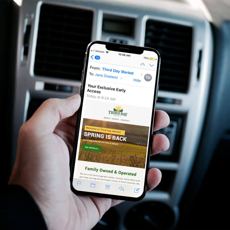
Creating a Unique Experience: Our team created a UX that ticked all the boxes of the strategic goals and established a fresh, unique look for the homepage. With mobile UX being even more important than desktop, our plan was to introduce modern elements of movement that would engage viewers and be ultra-relevant to the brand and to the message. We sourced a great sprouting video that would represent the Spring is Back font-masked intro, created unexpected visual breaks leading viewers’ eyes down the page to specific calls-to-action, and floated images that would show first-time viewers exactly what Third Day had to offer.
The homepage experience ends with a feed of the latest blog posts and an invitation to Take the Tour. If users’ need states were not addressed earlier up on the page, this would be another chance to get a click-through and conversion… not to mention, a chance to learn more about the history and culture of the market.
We continued this clean, engaging feel throughout the design of the other pages on the site include the About page, Blog Listing page, Pumpkin Patch page, and others.
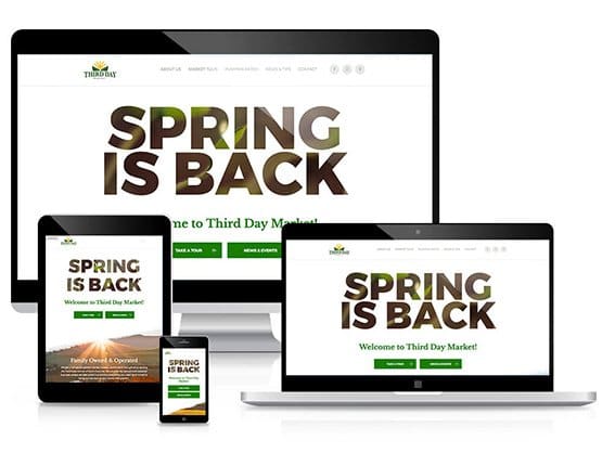
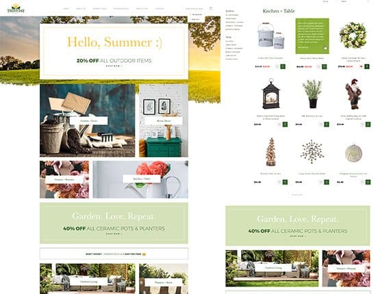
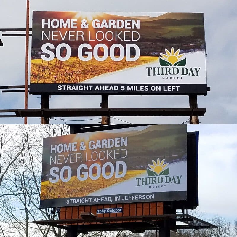
We have been honored to be a part of Third Day Market’s growth and expansion into more marketing channels. Their website traffic has improved, engagement and sales have increased, and their staff now have access to better tools. The new point-of-sale platform that we provided and integrated into their E-commerce website has transformed the buying experience for customers both in their stores and online. Not to mention, sales data is now integrated so they can keep a close pulse on their productivity at any time.


What I liked most about Chariot is not only did they tell me WHAT my business needed, they explained WHY my business needed it. I highly recommend this team for your branding, website, & marketing needs — they know what they're doing. Thank you Chariot Creative!
- K Carpenter, Third Day Market
