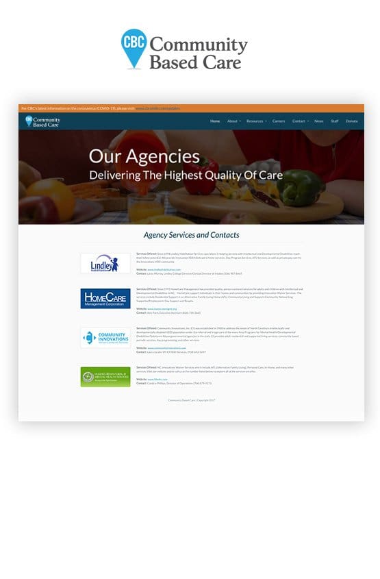
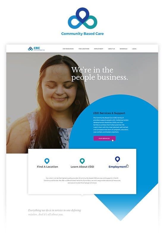
Community Based Care (CBC) reached out to Chariot in need of a fresh brand that would help to unify their growing healthcare organization. Acquisitions were happening quickly, and they needed a united front for their online and corporate presence. CBC had been successful in the Intellectual and Developmental Disability sector and was in the process of acquiring five additional businesses that offered peripheral services.
As our two teams met in their Raleigh, NC conference room, they voiced concern over rebranding — there was a big need to carefully navigate the transition from old to new without alienating existing, long-term partners.there was a big need to carefully navigate the transition from old to new without alienating existing, long-term partners. The CEO, CFO, and marketing director discussed the option with us of keeping current branding elements in the new logo along with the need to delineate the logo into off-shoots representing each of their, now, six agencies.


CBC identified themselves as a family of healthcare providers, and their passion for helping their clients was evident in their large network of partners, community involvement, and positive reviews. Put simply, they were in the business of helping people, and that would turn out to be a cornerstone of our branding and web design strategy for them. They would need to incorporate ways for users to find agency locations and be encouraged both about I/DD and the services that CBC provides.
In addition to the warm, human-centric tone that was starting to unfold during the Discovery and Planning phases, CBC also needed better online tools to help manage another important side of their business: Employment. They needed an Employee Dashboard that would be a way for staff to log in, read the latest announcements, download important private documents, sign up for CE and training, and more.
Branding: No house stands without a solid foundation. We started the branding and logo design for CBC by doing research into the competitor landscape. We identified common themes, colors, and trends with competitors regarding healthcare logo design. This helped to isolate features that we may, or may not, want to emulate with the new CBC brand. We identified ways to set CBC’s brand apart without alienating their current base.
Using our research and discovery data, along with CBC’s mission and goals, we identified a conceptual map that would help to guide us in the logo design, content tone of voice, UX design, and web design. Family, Integrity, Respect, and Reassurance were at the top of that list, with Compassion, Hope, and Diversity being an important underlayment. Those in the I/DD community needed help — hope and respect was an important part of getting it.
Web Design & Development: With research complete, and a new approved brand, we began to plan and build the new CBC website. We started with building a Site Map that included content and crosslink strategy. This plan was important to guide all efforts in writing content, establishing the UX Design, and content implementation once the website had been developed.
The web design prototypes included the innovative use of branded elements, a plan for hovers, scrolling, and on-screen interactivity, careful image choices, and a plan for desktop-to-mobile curation. Our practice is to not only build websites to be mobile-responsive, but mobile-reactive as well. This maintains the best user experience on mobile devices where screen real estate is limited.
Next, we carefully built the Web UX and Wireframes which served as line & block blueprints for the design. We strategically developed the user flow based on CBC’s target audience, our industry and SEO research, and the content strategy we’d established in the previous project phase. Featured sections, pull quotes, images, and calls to action were all strategically placed to engage users and compel them to convert.
The client loved the designs, and after a few tweaks our developers began the web development. This included hand-built foundational code for front-end elements along with custom-built admin dashboard elements on the WordPress platform. To put it simply, this empowered our client’s team to be able to edit the content and have flexible options for years to come without it costing the integrity of the website.


The resulting website serves as an engaging presence for CBC. Our team has thoroughly enjoyed learning about CBC and the I/DD community as a whole. We have continued to provide website hosting & security for CBC, and we plan to continue well into the future for additional marketing efforts and design of additional materials to help streamline their new branding. The all new branding and website will serve as a tool that:
Services provided for CBC so far include:


Throughout the process, from design to development and testing, Chariot Creative has delivered to a very high standard. They embraced the challenge and immersed themselves into a new industry to make sure they understood our concept, providing great advice & strategies along the way. We hope to continue working with Chariot Creative as we continue to grow and could not recommend them highly enough.
- Director of Nonprofit Client

